(EDITOR'S NOTE: I got AI to write the first draft of this article, relying on the transcript of my coding session within Claude Code inside Visual Studio and a custom skill I developed to replicate my own writing style. Then I used Distro Publisher, our official MCP server, to file the story as a draft directly from Claude Code to my newslode. The AI-generated draft wasn't horrible but I then basically rewrote almost the entire thing using DistroVerse's editing interface.)
I’ve been building DistroVerse with Claude Code for months, a sometimes exhilarating and often quite tedious experience.
The routine goes something like this: I think of a feature I want to add, describe it to the bot, wait for it to cogitate, review the plan, approve the plan, wait for it to deploy in test mode, then spend four times as much time debugging and tweaking.
Sometimes, if you actually take the time to read all the fine print it's spitting out, you get an unexpected lesson in coding or web design.
Last week I was trying to figure out how owners of newslodes (our term for a digital newspaper, magazine or blog) could preview their new publications prior to actually making them public.
I started describing this situation to Claude Code and made the point that there would need to be strong visual cues to the newslode owners so they would know they were looking at a non-public newslode. My main concern was that, without those, the newslode owner would panic and think they had accidentally published it. I could totally imagine myself having such a panic attack. Not the best user experience.
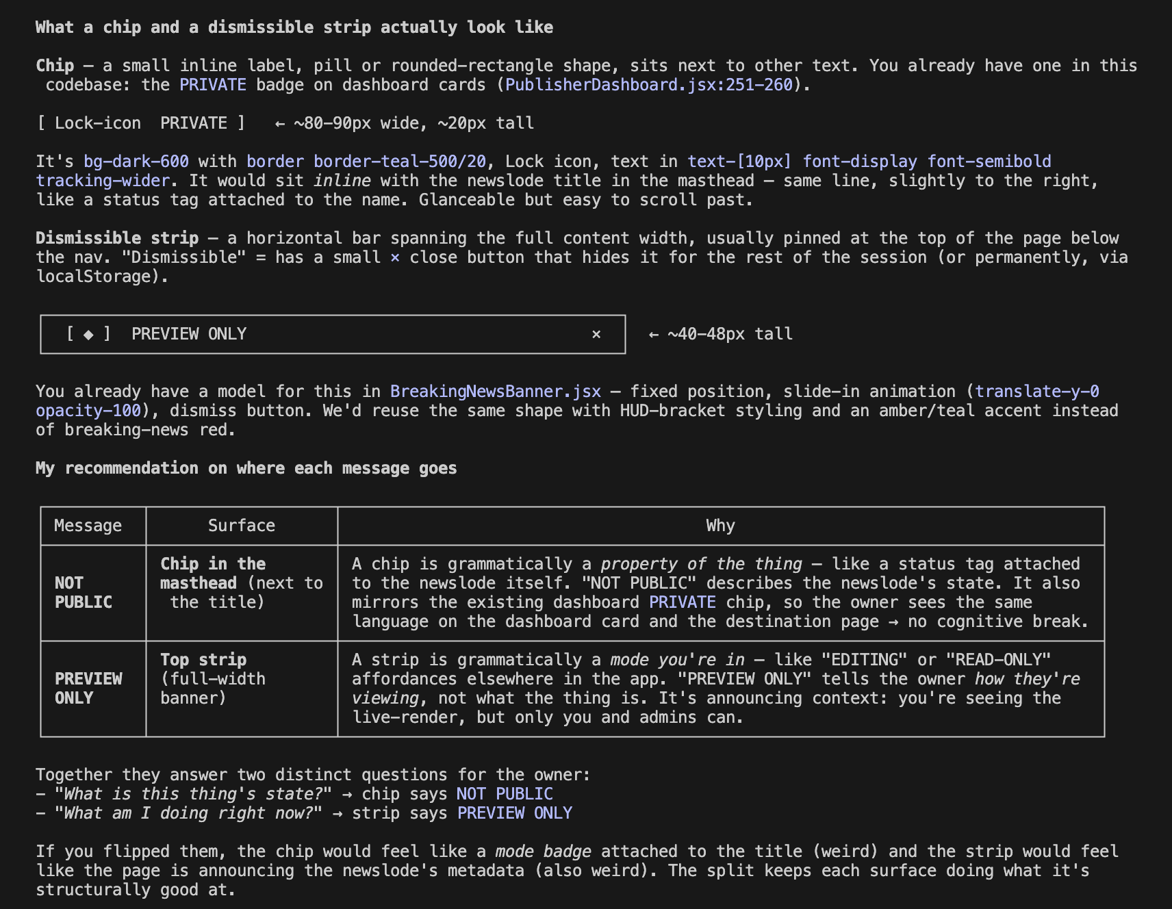
Claude Code suggested two visual cues — a NOT PUBLIC chip next to the title, and a sticky, non-dismissible PREVIEW ONLY strip across the top of the page.
I asked a follow-up: “How did you decide which of these labels to put on the strip, and which one to put on the chip?”
A chip, Claude Code explained, is a small inline label — a status tag attached to a specific thing, sitting next to the thing’s name. It describes the current state or condition of a thing. So in our case, NOT PUBLIC would go on the chip. It describes the current state of the newslode.
A strip is a horizontal bar that runs across the top of a page, announcing the mode you’re operating in. It describes the viewing context. So in our instance,PREVIEW ONLY would go on the strip. It tells the user what they're doing right now, which is looking at a preview, not a live page.
Claude Code summed it up:
“If you flipped them, the chip would feel like a mode badge attached to the title (weird) and the strip would feel like the page is announcing the newslode’s metadata (also weird). The split keeps each surface doing what it’s structurally good at.”
The immediate takeaway for me was a tiny lesson in web design – and a reminder of how much I do not actually know about web design – that actual pro web designers do actually know.
But a broader takeaway was that if you slow down to pay attention while the AI is cooking up your new app feature, you can teach yourself a lot.
A screen grab of the raw transcript is below: